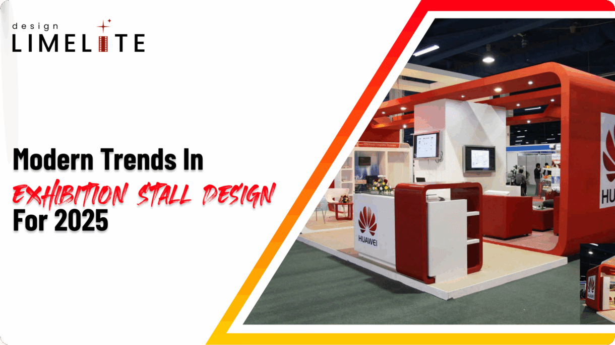
Exhibition stall designs are changing. In 2025, they are not only places to display products, but they are spaces built to tell a story. Brands want stalls that look good and say something clear about who they are.
Designs are simpler. Layouts are more open. And visuals are sharper. The goal is to help people move freely, feel curious, and stay longer.
Here are a few formats that stand out:
- 3D exhibition stall design adds depth and makes the space feel more interactive.
- Open layouts remove barriers and invite people in.
- Minimalist setups keep things clean and focused.
Good stall design isn’t about being flashy. It’s about being clear, useful, and easy to remember.
This blog looks at how exhibition stall design is changing in 2025. If you are searching for exhibition stall design ideas, this guide gives you a clear starting point.
The Rise of Immersive Experiences
Exhibition stalls are not just for displaying products now. They are built to make people feel something. Brands are using 3D exhibition stall designs, interactive tech, and sensory design to pull visitors in and keep them interested.
What’s Changing
- 3D exhibition stall design helps guide people through the space. It is not just about looks—it is about flow.
- AR and VR let visitors explore products in a virtual setting. They can test, view, or interact without needing the real thing.
- Touchscreens and digital displays offer demos, customisation, and quick feedback.
- Sound, scent, and lighting add emotion. These elements make the experience stick.
Real-World Examples
- One brand used VR to show off its full product line in a small space. Visitors could walk through a virtual showroom.
- Another used AR to explain how its machines work. No need for bulky samples.
- A sustainability company built an open layout with soft lighting and quiet soundscapes. People stayed longer and asked more questions.
This shift is not about being flashy. It is about helping people connect with what a brand stands for—and remember it after they leave.
Minimalism & Functionality
A simple exhibition stall design does not mean boring. Minimal layouts often stand out more, especially when they are paired with smart structure and bold visuals with a unique twist. These stalls focus on what matters:
- Clear messaging
- Easy navigation
- Strong brand presence
Why It Works
- Quick setup gives you more time to focus on visitors, not logistics.
- Clear design helps people see your message without distractions.
- Smaller stalls use space wisely and still make a strong impression.
- Lower build complexity makes it easier to adapt, reuse, or scale the design.
Where It Fits Best
- Startups looking to make a sharp impression without overcomplicating things.
- Tech expos where clarity and innovation matter more than decoration.
- B2B showcases that prioritise direct communication and a professional tone.
Minimal does not mean your stall is missing something, but it means choosing what matters. When used properly, it helps you attract visitors without trying too hard.
Open-Sided Layouts – A Strategic Advantage

Open-sided stalls help people move freely and notice your brand. They are built to handle more foot traffic and make the space feel welcoming.
The number of open sides depends on where your booth sits—and how much attention you want.
2-sided open exhibition stall design
- Best Placement: Corner locations
- Key Benefit: Entry from two directions and offers good visibility
- Design consideration: Keep branding visible from both open sides
3-sided open exhibition stall design
- Best Placement: Peninsula setups
- Key Benefit: Semi-enclosed feel and offers balanced openness
- Design consideration: Use walls to guide attention without blocking flow
4-sided open exhibition stall design
- Best Placement: Island booths at large expos
- Key Benefit: Maximum exposure and offers walk-in access from all sides
- Design consideration: Strong central branding and modular, flexible layout
Each layout has its plus points. Your choice depends on location and goals.
Sustainable Trends in Exhibition Stall Design
At Design LimeLite, we design exhibition stalls with care. We focus on what we can control using better materials and smarter processes to reduce waste.
We do not offer modular or reusable systems, but we still take sustainability seriously.
What We Do
- Eco-Friendly Materials
We use eco-friendly materials when possible. They are better for the environment and still strong enough to meet design needs. - Responsible Fabrication
We build with less waste. Our process supports cleaner production, even for one-time-use stalls.
What We Don’t Claim:
- Modular Stall Scalability
Modular stalls work well for repeat setups. We focus on custom builds that fit each event. - Reusable Structures
We don’t offer reusable systems yet. But we plan carefully and choose materials that last longer and waste less.
Brands Embracing Green Exhibition Practices

Customization & Branding
Your stall should feel like your brand. Not just in colour or logo—but in how it looks, moves, and speaks to people.
What We Do
- Match your brand and audience
We study how your audience behaves. Then we build around it. Every layout, texture, and light choice is made to fit your brand’s tone. - Use light and texture with purpose
Bright spots draw attention. Soft textures invite people in. These details shape how people feel in your space. - Create zones that tell a story
We design areas for demos, chats, and quiet moments. Each zone helps visitors understand what you do—without needing a long pitch.
Layout Choices Matter
- Simple Exhibition Stall Designs
It feels open and easy to navigate. They’re great for clear messaging and fast engagement. - 3D Exhibition Stall Designs
It creates layers and movement. They invite curiosity and help build immersive experiences.
The way your stall is built affects how people see your brand. We make sure that the impression is clear, honest, and memorable.

Conclusion
Exhibition stall designs are transforming. Brands now focus more on how people move through a stall space and not just how it looks. The goal is to make things clear and true to the brand.
What’s Trending
- Layouts that guide people naturally
- Zones for demos, quiet chats, and product displays
- Lighting and texture that shape the mood
- Designs that reflect brand tone and audience habits
How to Choose the Right Layout in 2025
- Choose a simple layout for fast and clear communication
- Pick a 3D layout if you want a more layered and interactive feel
- Design based on how people move and respond—not just what you want to display
Explore how your brand can stand out with the right stall design strategy.
Design LimeLite builds stalls that feel like your brand. We do not follow templates. We shape each space around your goals, your audience, and how you want to be remembered.
If you are planning your next exhibition, we will help you make it count.
Source: https://www.designlimelite.com/modern-trends-in-exhibition-stall-design-for-2025/